Stop Losing Leads: The Psychology of the "Mobile-First" Call to Action
Feb 17, 2026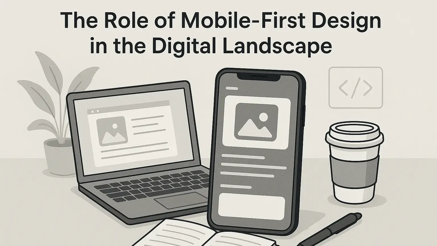
Last updated: October 2026 · Written by 20 Minute Marketing · 8 min read
Quick answer
A mobile-first call to action is a button designed for a thumb on a phone, not a mouse on a laptop. Put the main action within easy thumb reach, make the tap target big enough, use benefit-led button copy, add a line of reassurance underneath, and make sure the page loads fast. Every one of these can be tested and improved on any site.
Calls to action are one of the most practical skills in digital marketing, and one of the easiest to show an employer or client: change a button, measure the result. This guide is for anyone learning conversion work, whether you are building sites for clients, improving a website at work, or fixing your own. For the bigger picture, see the How Small Business Owners Should Choose a Marketing Course (2026 Comparison).
The desktop delusion
📘 Want the full picture? Read real-world marketing tactics, the complete pillar guide this article is part of.
Most websites are designed on a laptop. On a big screen, a small "Contact Us" link in the top right corner looks fine. On a phone, held in one hand, that same link is hard to reach and easy to miss. For local services especially, much of the traffic arrives on mobile, so check the device split in the site's analytics before you start. If most visitors are on phones, the call to action has to be designed for a thumb.
Step 1: Design for the thumb zone
Many people use their phones one handed, so the area near the bottom and centre of the screen is the easiest to reach, and the top corners are the hardest.
Where to place buttons
- Centre and lower screen: place the primary button, such as "Get a quote", where the thumb naturally rests.
- A sticky footer bar: for service businesses, a "Call now" or "Get a quote" bar fixed to the bottom of the screen keeps the main action in reach as people scroll. Test it, because it suits some sites better than others.
- Size: make tap targets big enough to hit easily. Google's guidance suggests about 48 by 48 pixels with space around them, and Apple's guidelines use a similar minimum of 44 points. Anything smaller leads to missed taps and frustrated users.
Step 2: Write button copy about the value, not the task
Words like "Submit" or "Contact" describe the work the visitor has to do. Button copy that names what they get usually performs better. Treat these as starting points to test, not guaranteed wins.
Rewrite examples
| Generic CTA | Benefit-led CTA | Why it can work |
| Submit Form | Get My Free Quote | Focuses on what they get. |
| Contact Us | Talk to an Expert | Positions the business as an authority. |
| Download | Get the Guide | Clear and specific. |
| Subscribe | Join 2,000 Local Readers | Social proof, but only if the number is true. |
Use AI for variations: an AI writing assistant can brainstorm five versions of button text in seconds. Ask for options that sound helpful rather than pushy for the specific audience, then pick two to test against each other.
Step 3: Reduce click anxiety
On a phone, people hesitate to tap if they suspect a long form or a sales call. A short line of reassurance under the button, often called micro-copy, lowers that hesitation:
- Under "Book now": "Takes about 30 seconds."
- Under "Call": "No obligation chat."
- Under "Download": "No credit card required."
Only promise what is true, and test the effect rather than assuming it. Our SEO marketing guide covers how landing pages, search and conversion fit together.
Step 4: Remove extra taps
Every extra step on a phone is a chance for someone to give up.
- Click to call: make every phone number a "tel:" link so one tap starts the call.
- Directions: instead of only listing the address, add a "Get directions" button that opens the visitor's maps app.
- Wallet payments: if the site takes payments or deposits, Apple Pay and Google Pay remove the need to type card details.
Step 5: Check mobile speed
Google's Core Web Vitals measure loading, responsiveness and visual stability. The current targets are Largest Contentful Paint within 2.5 seconds, Interaction to Next Paint under 200 milliseconds, and Cumulative Layout Shift under 0.1. If the call to action takes several seconds to appear behind a heavy image, many visitors are gone before they see it.
- The test: run the page through Google PageSpeed Insights on the mobile setting.
- The goal: pass all three Core Web Vitals.
- The fix: large images are the most common culprit. See our guide to creating and optimising website images.
Frequently asked questions
Should I use pop-ups on mobile?
Use them sparingly. Google's guidance warns against intrusive interstitials that cover the main content as soon as someone arrives from search. If you use one, delay it, keep it small and make it easy to close. Required notices such as cookie or age checks are treated differently.
What colour should a call to action button be?
There is no magic colour, but it must contrast with the rest of the page. If the site is mostly blue, an orange or yellow button stands out. Try the squint test: if you squint and cannot find the button within a second, it needs more contrast.
Can a page have two buttons?
Yes, but one should be the clear primary action. Make the main action, such as Call, a solid colour and the secondary action, such as Email, an outline or ghost button.
Can I practise CTA optimisation without a business of my own?
Yes. Audit three local business websites on your phone and screenshot each call to action. Redesign one in a free website builder or a mockup tool, write two button copy variations and explain which you would test and why. A before and after with your reasoning makes a strong portfolio piece for a marketing role or a freelance pitch.
Design for the thumb, not the eye
A site can look beautiful on a 27 inch monitor and still lose enquiries on a 6 inch phone. Thumb-friendly placement, benefit-led copy, honest reassurance and fast loading turn a browsing site into one that converts, and being able to make and measure those changes is a skill employers and clients pay for.
Ready to learn this properly? take Website Design: Website Wins ($99, 13 lessons).
Not sure which course fits where you are starting?
Answer a few quick questions and we will point you to the course that matches your goal, whether that is a marketing job, freelance clients or your own business.
Paid once. 12 months access. 30 day money-back guarantee.
Learn digital marketing in 20 minutes a day
Self-paced courses from someone who runs digital for two national brands. Build skills you can show an employer or a client.